Timberland
Art Direction-
Project Scope: Branding, Package Design, Video & Training Materials.
Timberland is easily one of the most recognizable shoe brand. The challenge was to design an attractive package line that would retain the spirit of Timberland. During the research and conceptualization phase certain considerations led us in the direction we took. For their care line identity, our approach combines minimalistic design with carefully selected materials. We used wine stock paper to enhance the feel of luxury linens. This elevated the simple layout by creating highly tactile, skin-like paper. For functionality we used multi layer labels when other languages was required. It was important to Timberland to stay eco-conscious. With that in mind the packaging, labels, inks and containers are made without PVC. The formulas are water-based and worker-friendly.

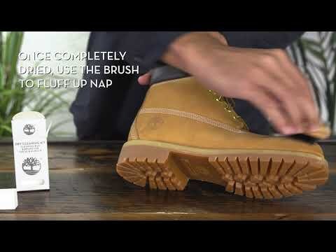
How to Clean My Timberland Boots | Timberland
I worked with the Creative Director and Video Production team to help create the How to Clean My Timberland Boots video. The educational video demonstrates how to clean and use each product in the line. It visually explains the process in easy to remember steps.

The Iconic Yellow Boot
To celebrate the iconic yellow boot we developed a custom brush. One side features a gum rubber eraser and the other, nylon bristle brush, molded in the shape of a Timberland boot outsole. Design to easily fit in your pocket, the brush erases stains and removes dirt from suede, nubuck, leather and canvas.
We developed several care kits for Timberland. The Boot Kit, Travel Kit, Sneaker Kit and Wipes were all developed to expand their existing shoe care category. Like the brush, the design of the Boot Kit took its inspiration from the boot color and stitching. Timberland creative team provided us with a lot of information and many illustrations we successfully incorporated. The modern monochromatic color pallet and matte uncoated finish enhances the kits and is cohesive with the entire product line.


Product Poster
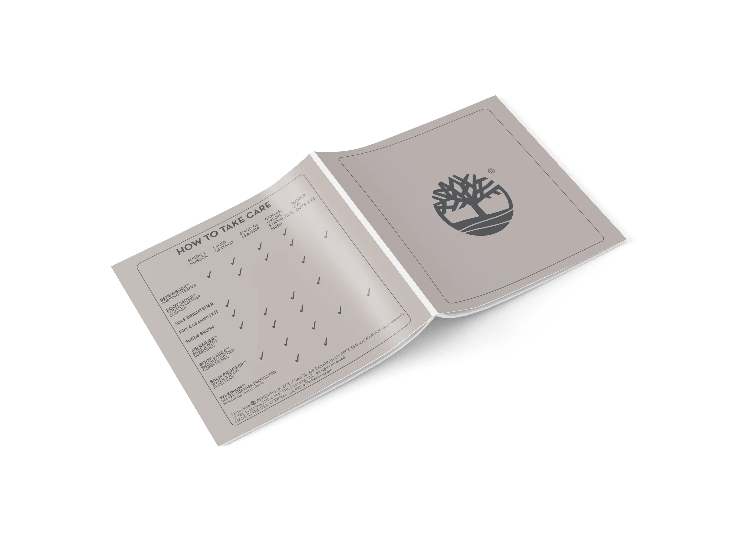
Creating the informational poster involved compartmentalizing each product into categories. My objective was to promote the new line and help educate the sales teams. The most taxing part of designing this poster was communicating the benefits in a compelling way. The check mark grid system explains which products work best on what type of material. The transparent and simple layout of the products provides intuitive use.


Clean, restore, protect!
Another series of brochures was constructed to further educate sales and consumers. Each page includes product information, directions and pictograph illustrations. We maximized the use of paper, spec’ing the same stock for the brochure and accompanying poster. The brochures were received as the most functional catalogs to date and was created in several different languages.


